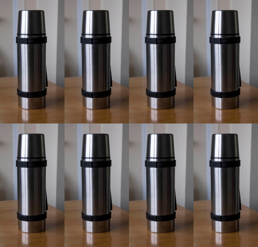
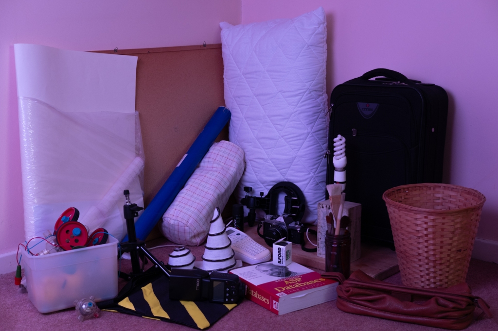
Repetition of one image or very similar images, whether exactly the same or with slight differences in exposure, crop or image quality, elicits an inquisitive eye. Repetition emphasises the sameness and yet paradoxically indicates a difference. Andy Warhol used this strategy in his screenprints and photographs. In the image below, do you notice how the dog’s ‘stare’ becomes more insistent through repetition?
Make a still life set-up of your choice, but you can use any subject.
Try to emphasise your subject with the use of light.
Aim to make around 20 photographs.
Choose the best shot and process it to your liking.
Now create a presentation of that one photograph that involves six to eight copies.
Make some notes on the overall effect.
Execution of brief
For this exercise I initially used a photograph that I had taken some time ago. The picture is a product shot of a pair of master cubes that my company produced, they are used as replica masters for moulding high accuracy retro-reflectors for laser alignment systems.
Because these cubes are very high precision and surface finish is very important they have a very fine finish and hence are almost perfect mirrors, this of course means there are a lot of reflections which I think makes them interesting photographically.
The picture is of a 2 inch cube and a I inch cube, the three faces of each cube that are presented to the camera are highly reflective, so the smaller cube appears in one of the larger cubes faces etc. I thought this would make an interesting repetition.
The objects were a bit tricky to photograph because of their high reflectivity, lighting and positioning of the camera were a little challenging.
I also tried another composition using a flask in natural daylight and with a coloured background
Reflection
I think it is interesting how the reflection of the 1 inch cube in the face of the 2 inch one makes it look like there is another cube inside the 2 inch one (both cubes are solid tungsten carbide), there is another reflection forming on that reflection in the top left corner of that reflection of the 1 inch cube.
I also like the way the 2 inch cube forms a right angle triangle on the top face of the 1 inch cube.
I find the longer I look at the image, particularly on a large screen the more my eyes and brain interprets the image differently, it feels a little like an optical illusion.
There is more to consider in the flask image, different colours and more directional lighting. The flask stands out from it’s neutral background in a single image, and I think the repetition makes this effect stronger.
Now that you’ve seen how to make a photomontage with newspaper cuttings, search through your archive of images to make a photomontage with your own photographs. Photomontage requires a playful experimental attitude to exploring different arrangements so don’t try to be too ‘tidy’ or perfect about your final result.
Decide on the different picture elements: the background, the different parts of the environment, objects and people in the environment.
Think in terms of depth: f/g, m/g and b/g.
When you’ve completed your photomontage, photograph it or save it as a finished image.
Execution of brief
I spent some time going through folders of photographs on my computers and selected a number to produce the montage.
As required by the brief I haven’t spent too much time being super “tidy” about cutting the images out.
The theme for my photomontage is memories of home – Cornwall.
Dreaming of Cornwall
Reflection
I did quite enjoy this exercise and although I haven’t been a fan of montages I am coming around!
I tried to select images where I could take elements and place them in the foreground, mid-ground and background. To make this look a little more realistic I changed the perspective and size of these elements.
I am quite pleased with the results and think it meets the requirement of the brief.
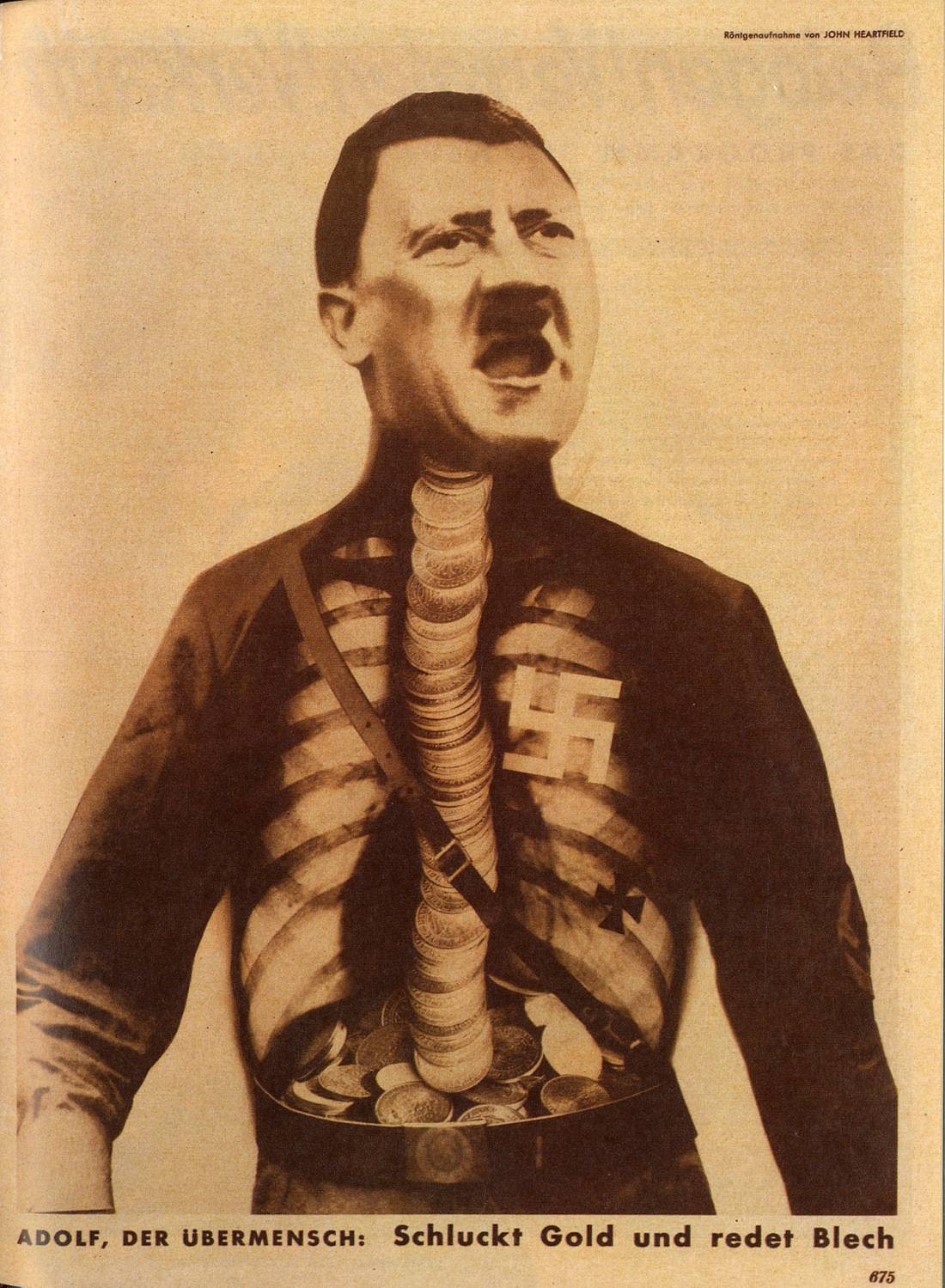
Juxtaposition in photography can be as simple as placing two photographs side by side. But juxtaposition can also be said to happen within the frame in still life when objects are purposely placed together. In photomontage rougher and often amusing juxtapositions result from sticking bits of pictures together. Have a look at the work of John Heartfield and Hannah Höch to prepare for this exercise. Heartfield’s photomontages are politically charged images designed to express social ills: http://www.getty.edu/art/exhibitions/heartfield
For more advanced contemporary examples, search for Beate Gutschow’s ‘S’ series.
Get a few old magazines or newspapers.
Decide on a background picture – for example a large view of space or any place.
Now add to it a figure or at least the head and shoulders of a person.
Now find some other images that you can substitute for the person’s head (for example a cabbage) or their eyes (telescopes) or mouth (a pothole). Stick them on the face.
Photograph the result.
As you can see, the process tends to result in bizarre combinations. But there is a deeper meaning to this process. By cutting and pasting fragments of images, you’re choosing how a picture should be made and offering an interpretation of the different subjects you choose. You’re also constructing an image in a way that would be impossible to construct in reality.
Execution of brief
Initial research
I took a look at John Heartfield’s and Hannah Höch’s work and as mentioned in the brief they are quite politically charged.
Höch (1889-1978) was a German Dada artist and was one of the originators of the photomontage, here work was politically charged.
1 A political iconoclast, she actively critiqued prevailing society in her work, and, implicitly, through many of her life choices. Her active interest in challenging the status of women in the social world of her times motivated a long series of works that promoted the idea of the “New Woman” in the era.
Heartfield (1891-1968) was German and born Helmut Franz Josef Herzfeld, his father was a Jewish socialist writer and poet.
2 Heartfield’s pro-communist, anti-capitalist photomontages emerge in a moment of war and revolution, and in dialogue with the late Weimar Republic’s commodity culture. His provocative photomontages aroused both critical acclaim as well as controversy at the time – especially famous are his anti-fascist montages, for which he was persecuted by the Nazis and spied on by Gestapo agents. The capacity of Heartfield’s photomontages to provide a technique through which to conceive alternative views of reality is his contribution to artistic practice across the media arts.
John Heartfield: AIZ/VI 1930-38
Höch’s Heads of State, 1918-20: ‘portly German politicians in their swimsuits floundering against a backdrop of fine embroidery’. Photograph: Collection of IFA, Stuttgart
Beate Gutschow (1970 – )
Gutschow’s, images are digitally composed and are quite realistic. Her “S” series stands for “stadt” which is German for city, they are large black and white photographs and composed from multiple images. Diverse architectural structures and geographical locations are combined within a single picture3
Although I did not set out with a theme in mind for my montage it occurred to me whilst I was looking through the magazines that I had been given, that our society is rather superficial.
My image evolved around the glitz and glamour of a female model with her lipstick and jewellery etc. located in a modern stylish kitchen but with no time or desire to cook, possibly with no knowledge of food production and preparation symbolised by the chicken egg and potatoes. I put the wings on the earthy potatoes to signify ingredients just appearing in the supermarket, I feel there is less awareness of food source or production these days.
Reflection
I understood the reason for the exercise, but I am somewhat ambivalent about photomontages, they are not something that I would go to naturally.
I think the works of Höch and Heartfield in particular are very clever and very powerful and must have been quite controversial at the time. Gutschow’s work is very different and although I find the images pleasing they do not generate much response from me apart from enjoying their geometry and composition.
Regarding my montage, this wasn’t an exercise that I was keen to do and I procrastinated over doing it for some days, however, once I had the spark of an idea and got into it I quite enjoyed it although I don’t think it is an avenue that I will go down in future.
Create a series of photographs that include deep shadow in much of the frame. You could achieve this by using a black backdrop or by exposing in high contrast light as in Part One Project 2 (Shadows).
Choose about four final images.
In Photoshop, place the images on top of one another and change the Blend Mode to Screen (removes the black from the image) of the images above the lowest image. Experiment with Luminosity and Colour blending modes. You may also want to reduce the Opacity of each image. Move them around with consideration for the sense of depth the image represents and try to create a final composite.
The image below was made by making a double exposure with a film camera. But you can do the same thing by using Layers in Photoshop.
Execution of brief
I confess I didn’t go out to take more photographs, instead I used pictures I had already taken. The background image was taken in April this year during a week break on the Isle of Skye, the others were taken during a recent visit to London.
The layers show the concrete structures in the Barbican area, the use of the ubiquitous smart phone and pedestrian / tourist life of the city, these are juxtaposed with the permanence, solitude, calmness and space of the Skye scene.
The pictures that I chose to use for this exercise are these:
Reflection
It was an enjoyable exercise, as instructed I used the screen mode to layer the images and feel the composite image is close to what I wanted to achieve.
I did try the colour blending and luminosity modes but these didn’t produce the results that I wanted. I changed the opacity of one or two of the layers and where there were sharp lines at the boundaries of the layers I applied a layer mask and painted these out with a soft brush.
Finally, I flattened the image adjusted the levels and contrast, reduced the size and then applied a little sharpening.
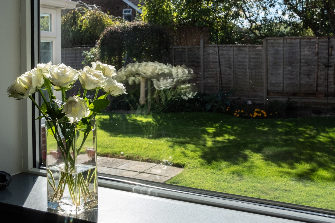
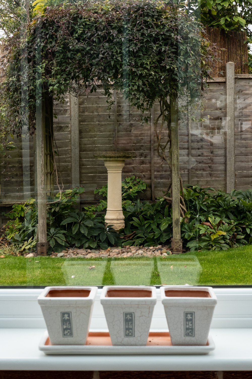
Most imagery contains layers of some kind: subject and background, f/g m/g and b/g, for example. In this exercise you’ll experiment with ways of making layered imagery in your camera and in the following exercise, you’ll experiment with using image layers in Photoshop.
Look out of a window from inside and make a photograph that includes all three of these elements: • foreground detail in front of the window
• a reflection of something in the window
• background environment on the other side of the window.
Consider the light carefully. If there’s a dark area on the other side of the window, it will help the window act as a mirror for an illuminated object inside.
Execution of brief
I took a few photographs trying to capture the reflections and managed to meet the brief requirements for an object in front of a window a reflection in the window and background objects although they are not great photographs.
Reflection
Although the pictures are not great, I think that they meet the brief requirements and demonstration how layers can be achieved within the camera.
Project 2 is about combining images in various ways to achieve a particular visual effect, for example by creating a patchwork of images, by layering, juxtaposing or repeating images or by creating a photomontage.
Exercise 4.4 Patchwork
Make a series of photographs of textures and colours, objects and forms. These can be close or wide shots of essential things like clothes, bricks, bark, grass, sky, etc. Try to render everything ‘abstract’ or not entirely recognisable by altering your viewpoint.
Reduce the file size of the images.
Save As…JPEG
Image Size > 1500 pixels Place the photographs together in a grid. Aim to make a composition of at least nine rectangle or square images.
Consider how the colours and textures, objects and forms work together and as a whole.
• which pictures seem closer and which appear further away?
• Which colours stand out and which colours (or tones) recede?
Save the arrangement with a different file name; call it Patchwork_1.
Execution of brief
Which pictures seem closer and which appear further away?
Assume the above grid is labelled letters for rows top to bottom and numbers for the columns then for me the following images seem closer: A3, A4, B1, B2, B4, C2, C4, D1, D3
The ones that appear to be further away are A1, A2, B3, C1, C3, D2, D4
Which colours stand out and which colours (or tones) recede?
The warmer, brighter colours stand out and the cooler, softer and darker tones recede.
Reflection.
It wold have probably been better or at least more obvious regarding prominence of images or not if I had produced pictures with greater contrast or more colour variation.
Have a look at Laura Letinsky’s website lauraletinsky.com. Also look at the still life work Bungled Memories by David Bate at http://www.davidbate.net. For a seventeenth-century comparison with Letinsky’s work, you can look at the paintings of Pieter Claesz here: http://www.rijksmuseum.nl/en/collection/ SK-A-4646/still-life
Write about the following issues in response to Letinsky’s photograph.
Visual description (objects & background/space)
Composition/design/arrangement
Sense of space or ‘dimensionality’
Connotations
My Response
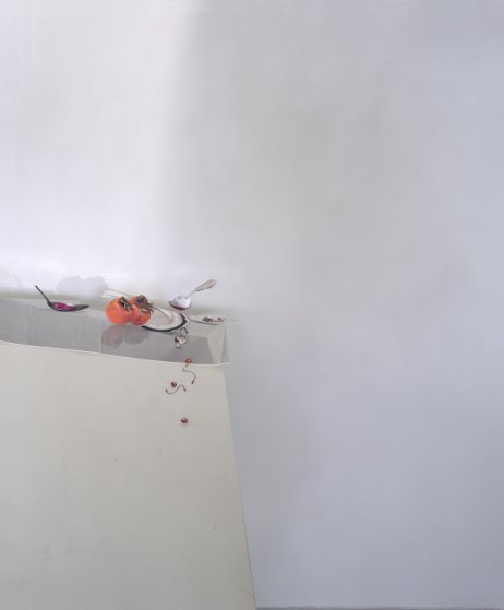
Visual Description – The objects look as if they are the left overs from a meal, there are two spoons, one with something in it, some, what looks like, persimmon fruit which haven’t been eaten but also some smaller fruit, which I take to be cherries together with cherry stones and stalks, there are also two plates one of which is broken.
The background looks like a plain white wall, the objects are on a table top which appears to be sloping down and is covered by a cloth which turns up?
There is then another plane in the foreground which almost looks like it should be a continuum from the table cloth but somehow this doesn’t quite fit as there is a lip.
The space is composed from a series of 3 intersecting planes, the foreground plane at the front of the table, the darker top of the table and the background.
Composition/design/arrangement – The table top appears to be sloping but the objects haven’t rolled off, a spoon floats above the surface of the table. There appears to be light from above producing shadows but also from the front as there are shadows on the background, however light is also coming from the left of the image on the background. As Letinsky says that she almost never uses artificial light this is a bit odd and plays tricks between with what your brain thinks its is seeing and what logic tells you, I think this is very clever.
The cherry stones appear to be falling off the side of the table or are perhaps stuck on them.
My eye moves from the left most spoon across to the persimmon fruit and the broken plate down to the cherry stones and then just to empty space.
Sense of space or “dimensionality” – The slightly darker, warmer foreground plane makes this stand out from the cooler toned background, there also appears to be a slight shadow produced on the background by it. There is also a shadow on the background produced from the table top, this gives the table separation from the background.
The gradation of the light on the background from the left of the picture gives a sense of space smoothness and dimension.
The warm colours of the fruit make them stand out or separate from the rest of the cooler image.
Connotations – The image has a dream like feel, it doesn’t seem “right”, the arrangement doesn’t seem possible. Words that I would associate with this picture are space, calmness, coolness, questioning, improbable, why, what.
Laura Letinsky’s web site
I took a look at series Ill Form and Void Full from which the picture analysis was taken and also Fall and both were very pleasing. I find the images very calm and simple but still raise questions as I have mentioned in the above analysis, I think her work is really very clever.
I wasn’t so keen on some of her other work for example, Venus Inferred, I didn’t really understand and didn’t find the images particularly pleasing. Some of the other series although I liked them I found that compared with Ill Form and Void Full and Fall, that there was more texture colour and objects in them for my liking and I didn’t find the lighting as subtle, I didn’t find I was asking as many questions as the other images and therefore they didn’t hold my interest as long.
There is a very interesting video interview with Letinsky here
“Using the conventions of the still life genre, this project examines the thesis that accidents are not necessarily ‘accidents’. Drawing on the parapraxes that Freud called ‘the psychopathology of everyday life’, the photographs record domestic objects broken by the author. ‘Bungled Memories’ challenges the assumption that the still life genre picture is purely ‘formal’ and the pictures draw attention to the social and cultural significance of the domestic field. Written captions alongside the photographs give clues to hidden (unconscious) meaning. The work also refers to fragments of paintings by Jean-Baptiste Greuze, the French painter championed in the late C18th by Enlightenment critic, Denis Diderot.” – David Bate
This series has a similar feel to Letinksy’s mentioned above, I am not sure I can unpick the narrative of Political Error, but I like the simplicity of the picture, the 4 quadrants of plane monochrome colour that almost look perfect, “spoilt” by the broken glass and the spilt wine. It seems to ask questions rather than telling a story.
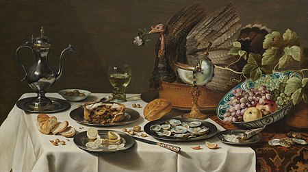
Pieter Claesz
Stilleven met kalkoenpastei, Still Life with Turkey Pie, oil on panel, 1627
The images produced by Claesz in the 17th century are a complete contrast with the Letinsky’s although the subject is similar. The one above is visually very dark and almost monochromatic, the objects are clearly recognisable and are part of a classic type of arrangement, for me there are not really any questions in the picture other than perhaps who was eating this meal and where they have gone.
The space and the arrangement of the objects is very traditional for the time in which it was painted.
Traditional still life presents a small-scale space to explore the composition and meaning of objects. But still life doesn’t have to be bowls of fruit and vases of flowers. You can place any object or combination of objects in any setting. And both can be constructed. It may be useful to think of still life as having two key elements – object(s) and setting – and go wherever your imagination takes you with them
Setting/background
Choose a space that you can work with over time. You don’t need the traditional wall and table yet, just a cleared space.
What does your space present you with? A wall? A floor? A corner? Put your camera on a tripod and aim it at this empty space. Now add to this space one large flat object. It could be a sheet, a painting turned back to front, an up-turned table or a large piece of paper stuck to the wall. Don’t place anything in the middle of space to act as an ‘object’ but rather compose your setting with surfaces, colours and textures. Have a look in the viewfinder. Note every element in the frame:
the way surfaces create angles, lines, shapes and planes
the way planes create a dimensional ‘space’
the effect of different lighting on this setting.
Take a photo.
This should be an entirely artificial, constructed image even with no proper sense of gravity.
Objects
Now choose a simple object and carefully place it into this composition. Avoid clichéd objects. Take a photo, then remove the object.
Replace it with another object, something very different. Place this object in such a way that it’s not emphasised. (Did your first photo emphasise the object?) Take a photo.
Now fill the space with a lot of different things (mattresses, furniture, crockery, books, plants, anything handy) and try to create an entirely constructed ‘environment’. Think about how objects coincide as planes, lines and points in your frame. It may be very messy, but it should depict a ‘place’ with an identity that only exists inside the frame of your camera.
Look at these pictures and you will see that gradually you have removed any trace of the original space. It could be anywhere. Just like a painter, you have taken control over every part of the picture.
Clear the setting. Keep the space free for your use as a ‘studio’ for a few days and experiment with different backgrounds, objects and lighting. Try to create different self- contained, unique environments. Experiment with creating a new sense of space.
Execution of brief
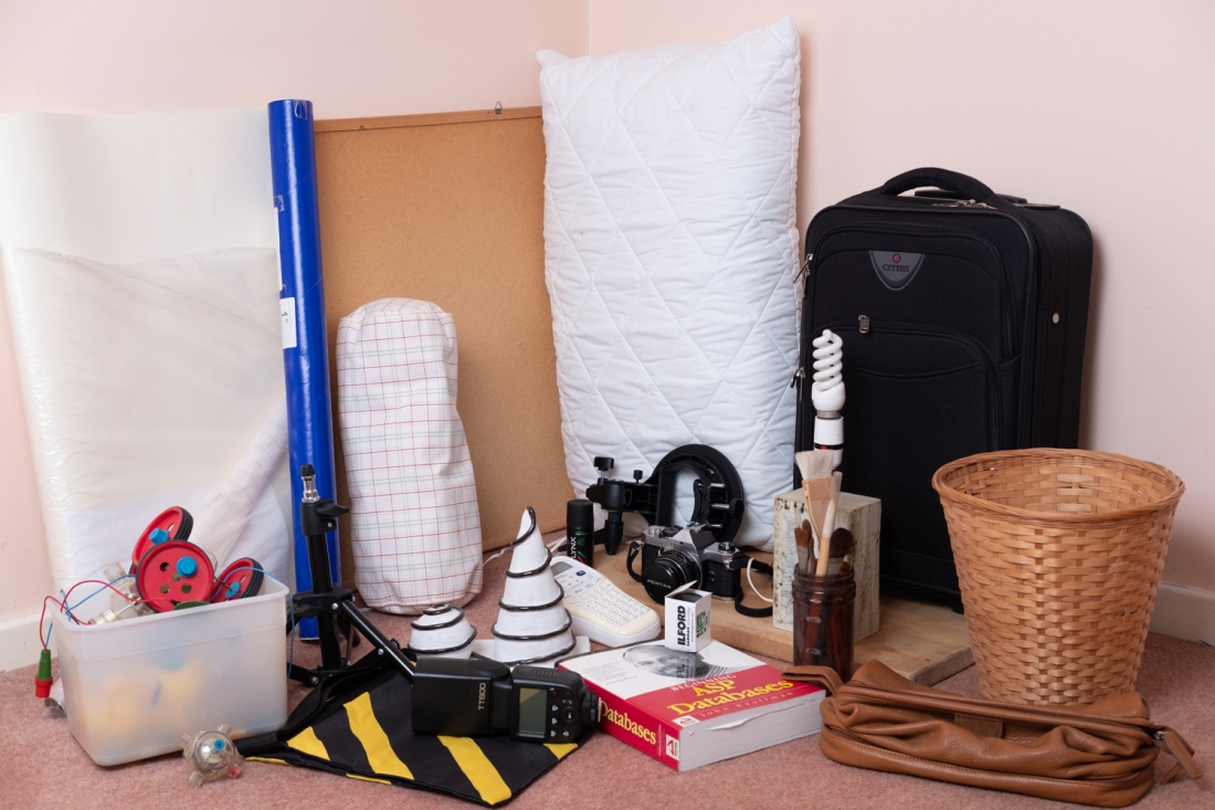
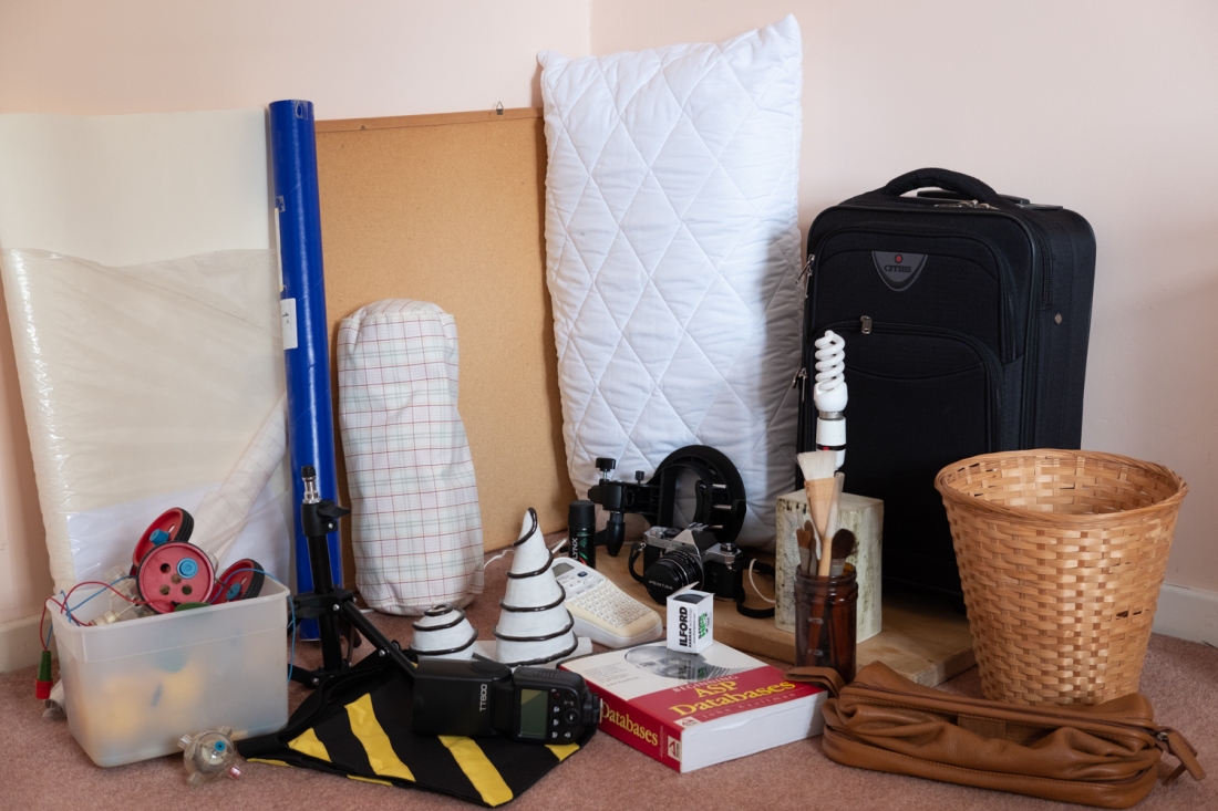
I read the brief several times before commencing this exercise and found it a little ambiguous, so this is my interpretation.
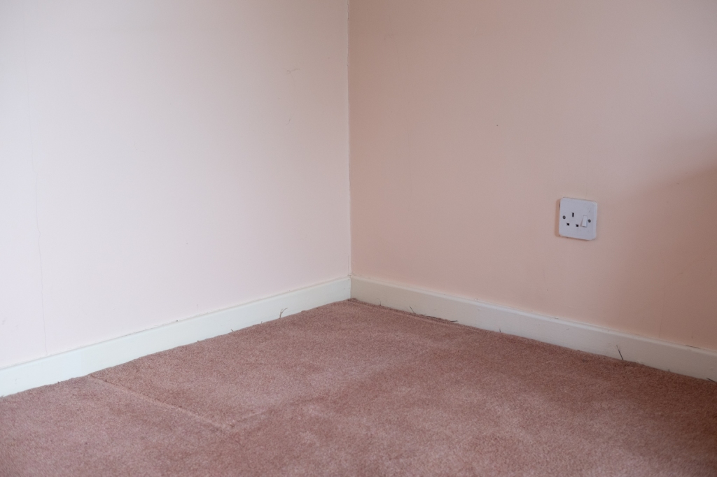
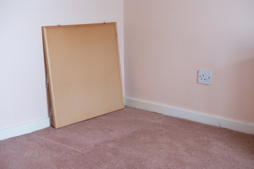
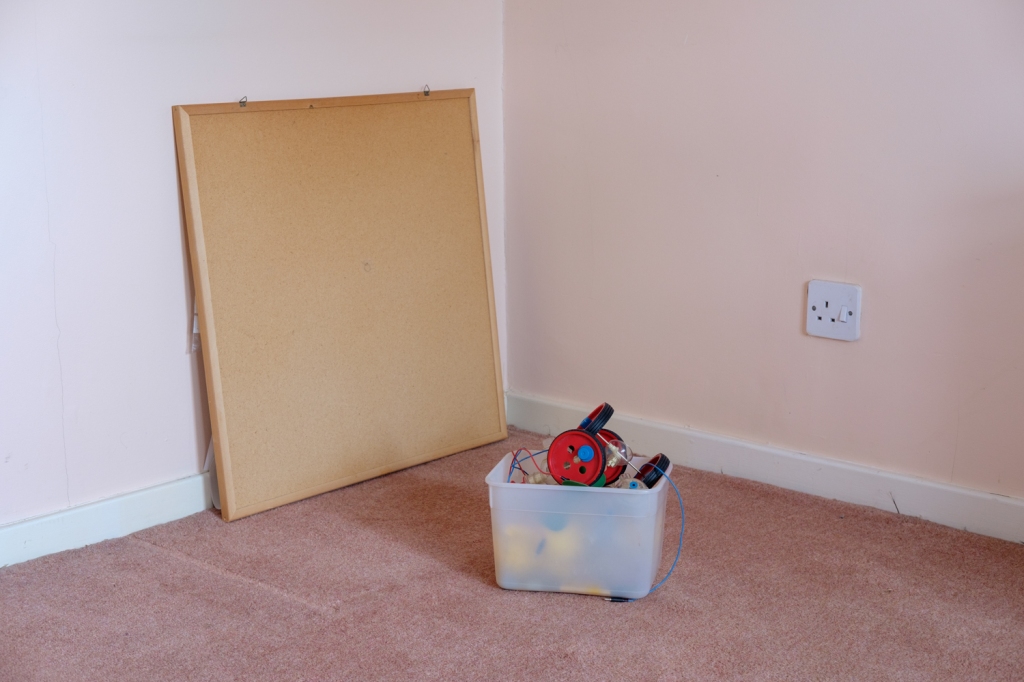
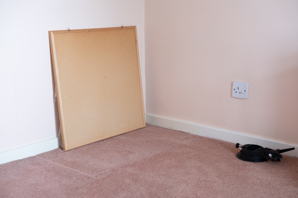
I used a room which is currently designated for refurbishment and selected one corner as my space. I followed the brief by placing a large (ish) object up against the wall then took a photograph.
Scene 1
Pic 1.1
Pic 1.2
Pic 1.3
Pic 1.4
The first photograph shows the empty space the second with the notice board against the wall. The board creates another plane in the image which intersects both the wall and the floor with a triangular shadow being created between the board and the wall.
I then placed an object into the scene and took a photograph, removed it and placed another image in the scene in such a way as not to emphasise it.
The first object was emphasised because I had placed it in the centre of the scene, so the two planes created by the walls leads your eye to it, also it had bright colours in it and was quite large.
The second object wasn’t emphasised as it was in the corner of the scene in an area that was in slight shadow, the object was also black and had a lower profile.
As per the brief I then filled the space with a lot of other things that were to hand.
Pic 1.5
I didn’t consciously try to arrange the objects, but I guess one naturally places things “in a position”, it did create a space that only exists within the frame of my camera, a specific scene.
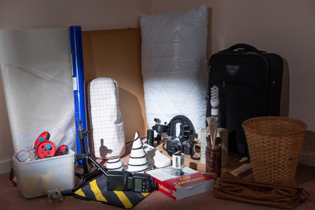
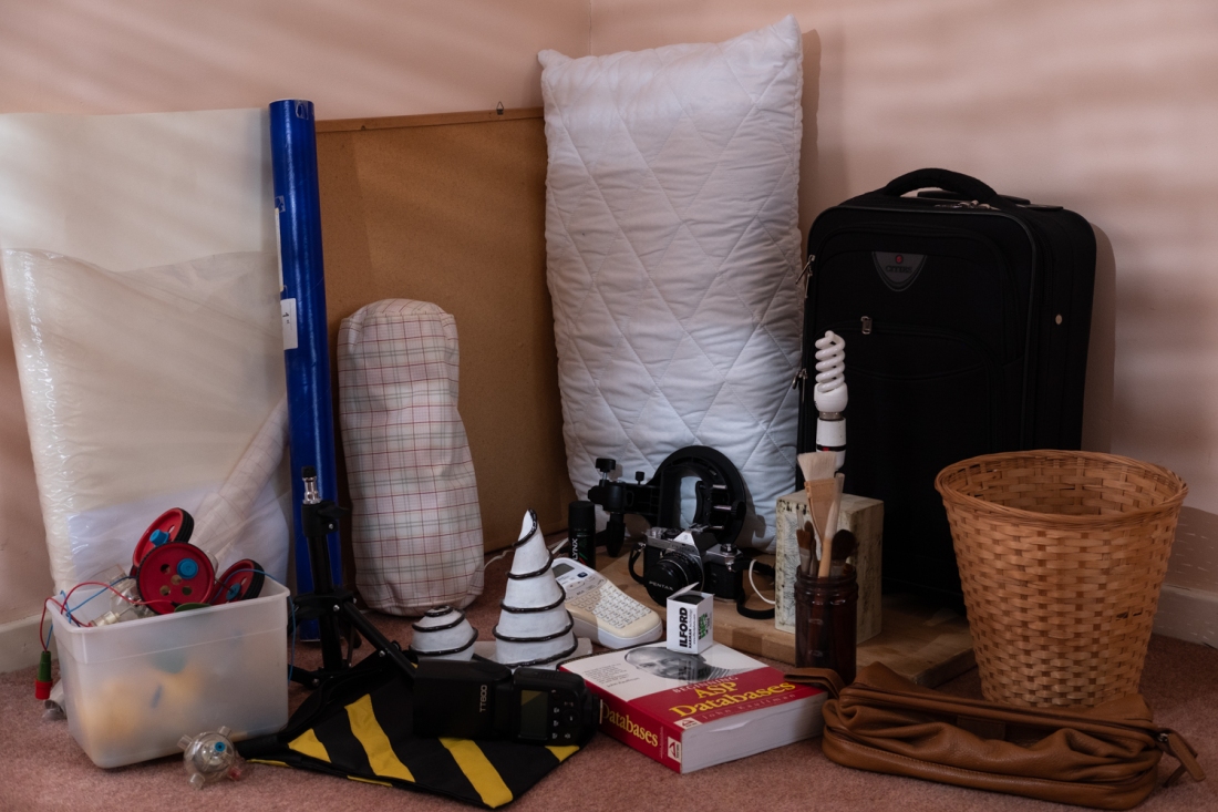
The above pictures were taken in a north facing room, so there was no direct sunlight and the light was quite diffuse and soft.
The brief required that I consider how lighting affected the scene, so I tried closing the curtains in the room slightly to make the light more directional, I used a flash with a shoot through umbrella and a snoot, I also used an improvised gobo which in the first set of images was a crocheted blanket. I used this to disturb the incident light and to see if I could create more atmosphere, change the perception of the objects and their arrangement within the scene.
I also tried using different coloured gels on the flash to see what effect this had on scene.
Pic 1.6
Taken using flash camera left, shoot through umbrella, A number of shadows have disappeared, and the image looks flatter, the colours look slightly more saturated.
Pic 1.7
Natural light but with the curtains partly pulled over to try to give more directional light. I can’t really see that this has had much affect at all, maybe I should have made the gap in the curtains smaller as I know this can work as I have used the technique in a previous exercise.
Pic 1.8
Flash with a snoot, makes it look like a spotlight has been used, I don’t find this a very pleasing image, there are harsh shadows with a lot of the scene in semi darkness. It gives emphasis to a small selection of the objects.
Pic 1.9
Using a crocheted blanket as a gobo to disturb the light and produce areas of light and dark which I think makes the image more interesting, but it does mean that not all objects can be seen clearly.
Pic 1.10
Pic 1.11
Pic 1.12
Pic 1.13
I then tried different coloured gels to see what effect they have, the only effect that I really noticed was that they tended to look a little more monochrome as some of the colours changed by the gels, the images also looked flatter.
This was probably because I was using the shoot through umbrella, so the size of the light source was relatively bigger and the fall off from light to dark more gradual so shadows less defined.
I then removed the objects and, on another day, made a different background and used a different group of objects.
Scene 2
Pic 2.1
Different background elements.
Pic 2.2
Different objects taken in daylight, the picture is soft and evenly illuminated, another different scene that only exists in this instance.
I then started to experiment with the light again using a flash, colour correction gels and another improvised gobo (a laundry basket) in conjunction with a home made and fashioned snoot made from cinefoil.
Pic 2.3
I eliminated ambient light from the picture by my choice of camera exposure then added an appropriate amount of light by the power settings on a flash, so all light is coming from the flash.
The above picture was taken using a bare flash to the camera right, it is more directional than daylight so gives more form to the objects and produces harder shadows, the colours are also slightly more saturated as in the earlier images where flash was used.
Pic 2.4
To make the light more interesting this image was taken by attaching the cinefoil snoot to the flash and I then used a laundry basket as a gobo held obliquely to the light so that the shadows were streaks. Adjusting the distance of the gobo between the light and the subject gives more or less definition to shadows created.
Pic 2.5
I removed the gobo and as I felt the light was a little cold in the previous picture I added a ½ Colour Temperature Orange gel (CTO) to the flash. This has produced a slightly warmer image.
Pic 2.6
The ½ CTO gel with the laundry basket gobo produces more atmosphere but I wanted a still warmer image that had the feel of evening sunlight streaming through something like leaves on a tree outside the window.
Pic 2.7
For this image I added a full CTO gel which gives a warmer colour, there is still direction to the light which gives form.
Scene 3
I then changed the scene again and repeated the exercises, however, rather than detailing a lot of lighting information etc. again I am just including the resulting images.
Pic 3.1
Pic 3.2
Pic 3.3
Pic 3.4
Reflection
It was an interesting exercise.
Three distinctly different scenes have been created and each scene only existed within the frame of the camera at that instant, the lighting changes the perception of the objects giving form or lessening it and affects how the objects coincide with each other.
Lighting intrigues me, it can dramatically affect how something is viewed. It can change the “feel “of an image, changing perception of the composition and the objects within it, it creates atmosphere or mood.
The effect of the lighting on the same scene can very clearly be seen when comparing images Pic 2.2 and Pic 2.7
In this first exercise, you’ll use fragments of still life images to create a combined design.
• Arrange a still life set-up that includes a background (preferably an ironed white or black sheet) and three distinct objects. It would be helpful if at least one object was sized at least 0.5m or you’ll be photographing everything in macro.
• Use either sunlight from a window or one single source of electric light to cast shadows and bring out the 3D form of the objects.
• Photograph around the objects, both close and wide shots, not all from the front.
• Capture the edges and the lines of the objects as well as defined shapes within them – for example the sound holes of a violin.
• Capture edges where light and shadow create a sense of depth or recess.
• Take pictures of the textures and colours of the objects.
• Think of this project as collecting impressions and perceptions of these objects and let this guide your camera.
• You’ll need approximately 20 well-exposed images.
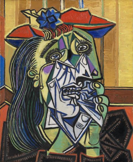
The idea behind this exercise is to imaginatively combine the different photographs into a single conclusive design. Have a look at some Cubist paintings and sculpture as inspiration. Notice how one object blends into another and how different viewpoints of the same object co-exist in surprising ways. The classic example of this is Picasso’s combination of the front and profile of a face, as in Weeping Woman, which you can see on the Tate’s website. Then look at Brendan Fowler’s Spring 2011 – Fall 2012 on the New York Museum of Modern Art (MOMA) website, which attempts similar arrangements using photography.
Combine the photos by arranging prints or by using Photoshop to assemble the images as different layers. Cut the images and choose only fragments of each image, matching up lines so they flow and placing shapes in meaningful juxtapositions as defined points in the composition. You should find the composition grows into a large picture. When you’ve finished the design, photograph it or save it as a finished picture.
Execution of brief
I started off by looking at the suggested works of the Weeping Woman by Picasso and Brendan Fowler’s work Spring 2011 – Fall 2012 and also at other cubist work.
Picasso – Weeping Woman
Weeping Woman 1937 Pablo Picasso 1881-1973 Accepted by HM Government in lieu of tax with additional payment (Grant-in-Aid) made with assistance from the National Heritage Memorial Fund, the Art Fund and the Friends of the Tate Gallery 1987 http://www.tate.org.uk/art/work/T05010
I thought the background as to why the image was painted was very interesting and rather than trying to paraphrase it I include here the description from pablopicasso.org.
“The Weeping Woman series is regarded as a thematic continuation of the tragedy depicted in Picasso’s epic painting Guernica. In focusing on the image of a woman crying, the artist was no longer painting the effects of the Spanish Civil War directly, but rather referring to a singular universal image of suffering.
Picasso’s insistence that we imagine ourselves into the excoriated face of this woman, into her dark eyes, was part of his response to seeing newspaper photographs of the Luftwaffe’s bombing of Guernica on behalf of Franco in the Spanish civil war on April 26, 1937. The Weeping Woman, 1937 came at the end of the series of paintings, prints and drawings that Picasso made in protest. It has very personal, Spanish sources. In May 1937 Picasso’s mother wrote to him from Barcelona that smoke from the burning city during the fighting made her eyes water. The Mater Dolorosa, the weeping Virgin, is a traditional image in Spanish art, often represented in lurid baroque sculptures with glass tears, like the very solid one that flows towards this woman’s right ear. Picasso’s father, an artist, made one for the family home.
The model for the painting, indeed for the entire series, was Dora Maar, who was working as a professional photographer when Picasso met her in 1936; she was the only photographer allowed to document the successive stages of Guernica while Picasso painted it in 1937.
Dora Maar was Picasso’s mistress from 1936 until 1944. In the course of their relationship, Picasso painted her in a number of guises, some realistic, some benign, others tortured or threatening.”
Picasso explained:
“For me she’s the weeping woman. For years I’ve painted her in tortured forms, not through sadism, and not with pleasure, either; just obeying a vision that forced itself on me. It was the deep reality, not the superficial one… Dora, for me, was always a weeping woman….And it’s important, because women are suffering machines.”
The image uses strong blocks of colour, the central area, around the mouth and nose and under the eyes shows the anguish and tears from the eyes, this is coloured in a cool blueish purple colour which for me denotes grief or mourning and contrasts against the reds, yellows and greens.
The angles created in the centre are very sharp or acute I found this accentuated the emotion of distress.
Other artists
Before producing my images I looked at other artists for inspiration on how the final composite image may be composed.
These artists were:
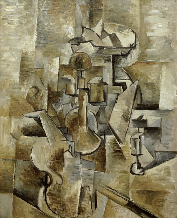
Georges Braque (French 1882 – 1963)
Violin and Candlestick – San Francisco Museum of Art
Albert Gleizes (French 1881 – 1953)
Cubist landscape – published in Der Sturm 5.10.1920
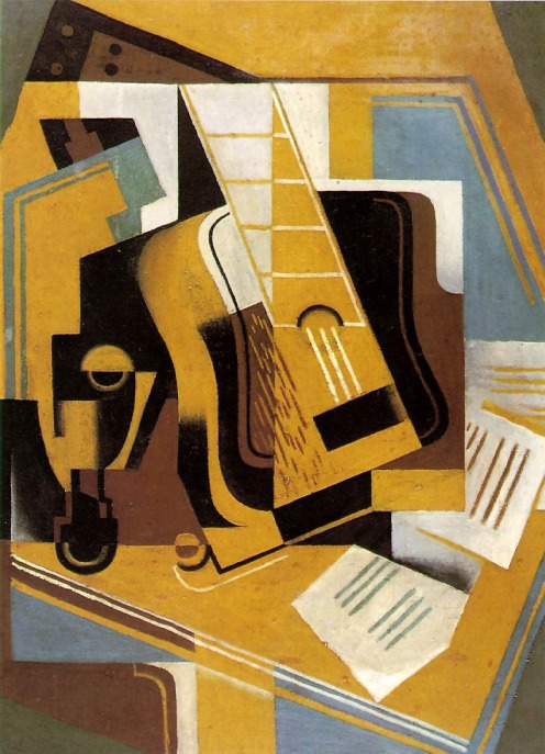
Juan Gris ( Spanish 1887-1927)
The Guitar
Brendan Fowler (American 1978 – )
Fowler is a musician and a multidisciplinary artists who works in photography, sculpture and performance.
Spring 2011 – Fall 2012 is a series of framed images some partly torn or fragmented arranged on top of each other.
Spring 2011-Fall 2012
My process
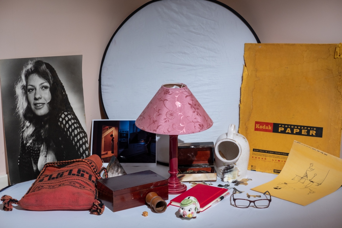
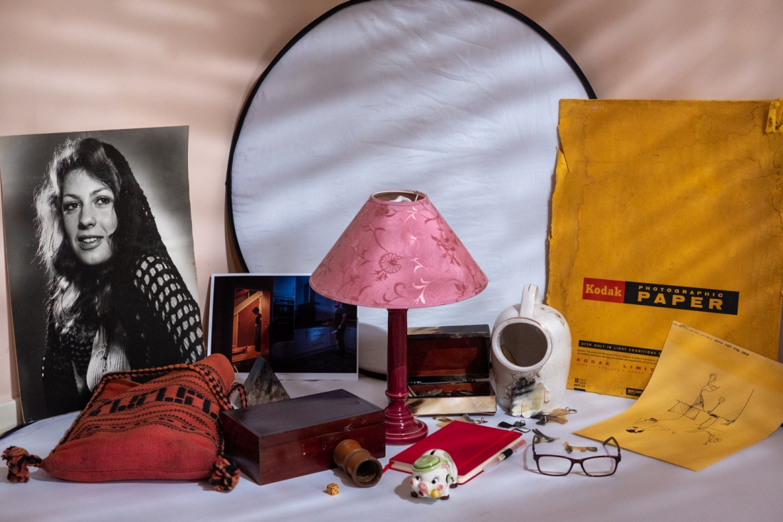
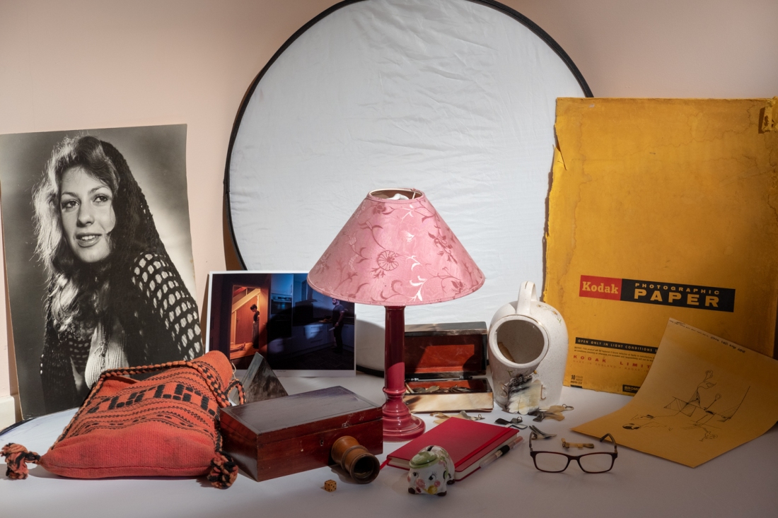
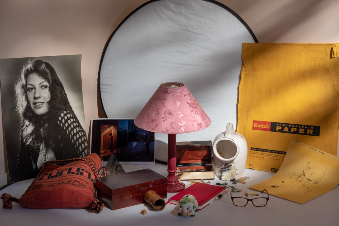
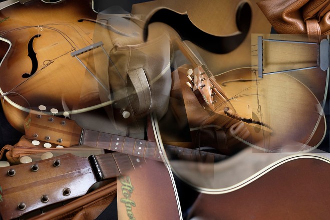
For this still life I used a black backdrop, an old broken Höfner guitar, a leather wash bag and a canvas camera bag.
I arranged the components on a table in a casual manner opposite a window. I used natural light with a 3200 ISO setting on my camera and proceeded to take a series of pictures in the manner required by the brief.
I selected a number of the pictures and loaded them into Photoshop. I cut out the parts of the images that I wanted to use for the composite and pasted them into the base layer image as separate layers.
I used masks to blend the layers a little but also tried to retain some of the “cut edges”. I tried to blend the shapes and colours together so that they either ran into each other or were juxtaposed.
In earlier years I went through a period of producing cubist type paintings in acrylics and oils and found this was a different process to using Photoshop to cut and past the image snippets in the form of layers then manipulating them to try to achieve a satisfying arrangement.
Painting was a more organic evolution of the final piece and more expression could be imparted through the brush and paint. However, I still enjoyed this process.
I tried to connect views, forms and colours in this final image.
Part Four encourages you to use the genre of still life as a laboratory for visual experimentation. Digital imagery offers photographers immense control over the image, making it easy to layer, juxtapose and combine different pictures or objects.
In Part Four, you’ll learn how to:
arrange everyday objects to create a constructed ‘scene’
• use a range of methods for combining images
• gain control over every aspect of the picture
• emulate key visual qualities in other photographers’ work.
Everyday life throws up many unlikely juxtapositions and symbols. Look up Peter Fischli and David Weiss’s Quiet Afternoon series and have a look at their amusing video ‘The Way Things Go’ on YouTube: http://www.youtube.com/watch?v=GXrRC3pfLnE
Also look at Peter Fraser’s close shots of found phenomena at http://www.peterfraser.net. These photographers either create or find salient and amusing new meanings in everyday objects. The visual description of their images is not what the work is ‘about’, but the effect of a juxtaposition, arrangement or phenomenon.
Peter Fischli, Davis Weiss
I watched the video on Youtube “The way things go” but have to say initially I wasn’t really sure about the “juxtapositions and symbols”.
The video was about a series of every day or mundane type objects an initial action of lighting a fuse wire which is restraining a tyre causes the tyre to roll and this then causes a further series of actions and reactions.
The juxtaposition appears to be the action and hence reaction of one object against another, the film seems to symbolise how freedom is given once objects are freed from their intended purpose.
After doing some further research I found that although the film appears to a be single continuous series of actions and reactions it is not as it seems. This is a quote from https://www.guggenheim.org/artwork/32552
Peter Fraser I looked at the Peter Fraser project Everyday Icons.
I must have spent more than half of one hour flicking through the images trying to understand what the work was about. In the course notes it says it is about the juxtaposition, arrangement or phenomenon and unfortunately I really didn’t get this at all, however, I do recognise art is subjective and it will mean different things to different people.
I did enjoy some of the arrangements, also colours and lighting and there was also a little irony in Dark Lane which require a flash for illumination.
“Historian and curator David Chandler has described the Everyday Icons series as epitomising Fraser’s practice and his fundamental belief ‘that looking intently in this way at very ordinary things, seeing them as plainly as they are, can become in itself freighted with an unexpected longing, and can conjure an image that is, in turn, the measure of something both achingly real and strangely ethereal, and stubbornly unforgettable’ (David Chandler, in Tate St Ives 2013, p.46).”
“two plastic buckets sit next to each other on a schoolroom floor. Both are blue, one lighter in colour than the other. Shot against the dark floor, the buckets appear to hover in a void, their colour, shape and form combining to transform them from banal, everyday objects into something more iconic.”
The last quote relates to this picture.
Iconic? Not for me unfortunately. The colours are nice, the shapes pleasing but personally I don’t find this an iconic image.